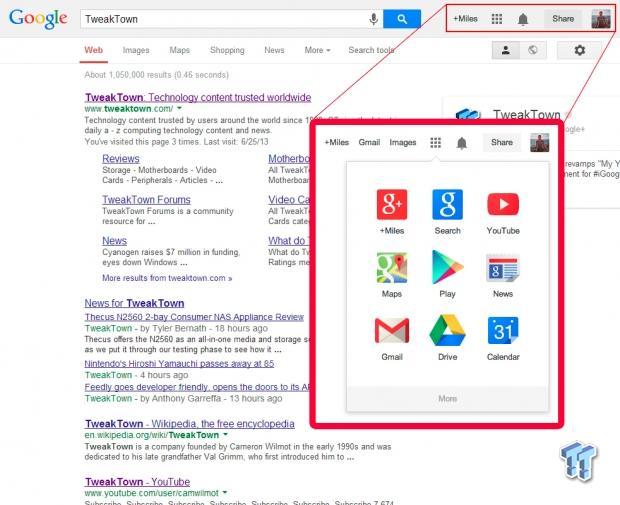
Today, Google unveiled a new logo and a completely redesigned navigation bar that effectively removes the black bar that resides at the top of the screen when visiting any of Google's online services. The new logo is much flatter and removes the glossy embossing that it featured for so long. Additionally, the font is a little bit different and the colors are a little more subdued.

The other major change is the removal of the black navigation bar we first hated but quickly grew to love. It has been replaced by an icon that opens up to reveal a Chrome Launcher-style window that lets you choose which service you would like to navigate to. I don't know how I feel about this yet as it seems to add an additional click into my workflow. I'm sure that as time progresses I will learn to love it just like I did the black bar.
The new logo and navigation bar will roll out to all users in the coming weeks and will be featured on mobile devices as well. Google says that these changes have been made to help streamline user workflow and to bring the company's UI up to date with current trends.

