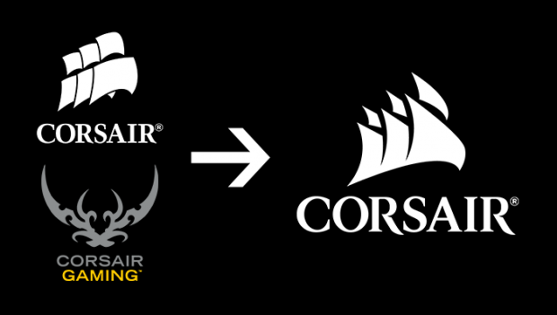
Recently Corsair introduced a new logo to much consumer criticism, with people claiming it looked like a weird tribal tattoo or a 'tramp stamp' and now it seems that Corsair has listened to our woes by re-introducing the sails, with a twist.

Looking like they've thrown italics on the old sail design, Corsair said in a recent blog that "everything we've announced at Computex 2015 will ship with the new logo, including the Strafe keyboard, and our powerful Bulldog 4K living room PC." If you've been living under a rock and have missed the Computex 2015 news haul or are simply too overwhelmed with the sheer amount of content, you can check out all of our coverage through the Computex link at the top of our home page - we've already covered what Corsair has to offer.
The old "crossed swords Corsair Gaming logo" is being phased out in what Corsair claims to be part of a process in which it is "uniting into a new modernized Corsair brand."
After three decades of the sail logo being prominent in Corsair branding, they don't see why it should change now.


