Windows XP might just be one of the most beloved versions of Microsoft's iconic OS, and it was fast, easy to use, and, best of all - stable. Well, at least once, the Service Packs rolled around. Apologies if this stat makes you feel old, but it debuted 21 years ago, back in 2001. Yeah, in the world of tech Windows XP is pretty ancient.
Many people still use the operating system in 2023, even for gaming, mostly to play older titles.

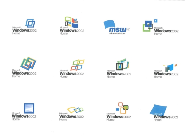
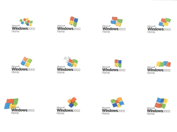
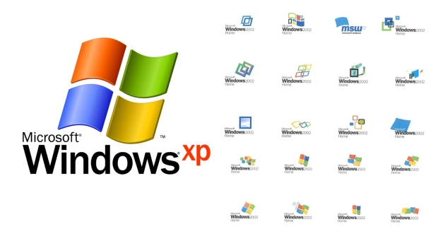
Today comes a little trip down memory lane and a glimpse at 'what could have been' designs for Windows XP logos. Microsoft turned to a company called Frog Design to create a new logo and help shape the look and feel of the UI and taskbars. At this point, the classic four window panes of the Windows logo were already well established, and even though brand identity was ultimately established with the final look, a few very strange options were put together.
One includes a single window looking out on a blue sky with clouds, another looks like a giant post-it note, and several variations on the four-window scheme are arranged differently. Plus, a few with six or more windows because why not.

These concepts were shared by Frog Design's creative director Casey Potter, who writes, "Our team developed a slate of fifty new logos, ranging from simple to radical alterations, the top three candidates were my designs so I was chosen to present them to Microsoft for selection. While recognizably a descendant of its predecessor, the reinvigorated logo is distinguished by its clean lines, energy, and movement - a bright, forward-looking emblem of the digital frontier."


