


Windows 11 could get a change to the Start menu which would make it easier to deal with your apps, rather than having them in a long list that you're forced to scroll through.
In case you didn't guess, we're talking about the All Apps section of the Start menu in Windows 11, which is currently laid out in a clunky list format - but all that could change if clues in testing are anything to go by.
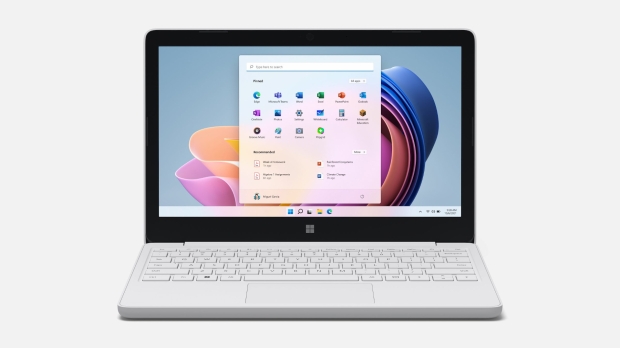
You may recall that Microsoft is testing a grid layout instead of the current scroll-athon of a list, and also that a new category view was spotted in testing quite recently.
Well, it appears the latter has progressed further down the line in preview, as Windows Latest reports that in the new beta build of Windows 11, the category functionality is more fleshed out (though note it's still hidden, and not formally being tested - yet).
Instead of being implemented as a makeshift piece of interface with colored blocks representing app icons, the application icons are now in place.
As Windows Latest points out, the category view presents apps - in categories, obviously (such as entertainment, or navigation and maps) - as a bank of four. However, when there are more apps that need to be listed, four mini-icons can be used in place of one, so if needed, up to 16 apps can be highlighted upfront in any given category.
Whether Microsoft will change this implementation, we don't know - we can't even be sure this Start menu tweak will go into testing (formally in a preview build, that is). It's one to keep an eye on, though, as it's definitely a better way of organizing the list of apps in the menu (as is the grid view, for that matter).
![Photo of the $10 PlayStation Store Gift Card [Digital Code]](https://m.media-amazon.com/images/I/41MT2s0Gm2L._SL160_.jpg)
 Redesigned Start menu now in testing finally lets us turn off some of the adverts in Windows 11
 Windows 11 users, get ready to see Copilot popping up in your Start menu (well, maybe)
 Windows 11 has a handy new shortcut for swiftly reducing the size of images you're sharing
 Hate Windows 11's modern looks and interface? Now you can make it look like Windows 95
 Microsoft is forcing the new Outlook app on Windows 10 users, ready or not
 Razer Soma Chroma is a new RGB Gaming Chair that syncs up with over 300 games
 You can now play Half-Life 2 in your browser
 GTA 6 is apparently already banned in these countries
 Steam Summer Sale begins, here are some of the best deals for under $5 and $10
 Anthropic says Alibaba used 25,000 fake accounts to query Claude 28.8 million times and train Qwen off the results
 Apple raises prices across the board, MacBook Neo now $699 while MacBook Pro sees a $300 increase
 The MacBook Ultra just lost its chip as Apple skips M6 Pro and M6 Max entirely
 DRAM prices surged by up to 89% in Q2 2026, destroying the consumer segment
 Most of Destiny team laid off, new Bungie leader steps down
 UGREEN NASync DXP4800 GT Review: powerful 4-bay NAS with AMD Ryzen and dual 10GbE ports
 Dell XPS 14 (2026) Laptop Review - Premium Quality, Impressive Performance
 Ocypus Sigma F36 BK ARGB Cooling Fan Review: high airflow and unified design in one frame
 PCCooler CPS RZ820 Display Review: a flagship-level CPU air cooler with an LCD screen
 Speed Racer (2008) 4K Ultra HD Blu-ray Review: a stunning remaster of the cult classic
 MOAIPLAY ORA PRO G1 850W ATX 3.1 PSU Review: high efficiency and 10-year warranty for $119.99
 Navman MiVue Smart True 4K Surround Dashcam Review - Seeing In All Directions At Once
 IQUNIX Magi96 Pro Aluminum Low Profile Mechanical Keyboard Review - Premium Build, Satisfying Sound
 Asetek Forte S-Series Racing Simulator Bundle Review
 6 underrated Microsoft Word features worth using to boost your productivity
 Level Up Your PC Gaming with these Fantastic ASUS Prime Day Deals on GPUs, Motherboards, and More
 GIGABYTE Wants to Kickstart Your New Gaming PC or Upgrade with These Limited-Time Deals
 7 Windows settings to change right after installation for better privacy, security, and performance
 I stopped Windows 11 notifications from interrupting me with Do Not Disturb, Focus, and a priority list
 I read the Windows Backup app screen carefully, and it does not back up what most people think
 Low Sound Volume on Windows 11? How to fix audio issues and restore normal volume
 8 Critical Warning Signs You Should Never Ignore in Windows 11
 This Windows security feature protects Documents from ransomware, but it is off by default