Recently Slashdot announced the websites third redesign in its thirteen year lifespan, and TweakTown was invited over to take a look at the new diggs. This morning I was given a personal walkthrough with Slashdot's Senior Editor, Tim Lord, who emphasized that Slashdot's goal with the redesign is to help better deliver content to its readers across all devices.

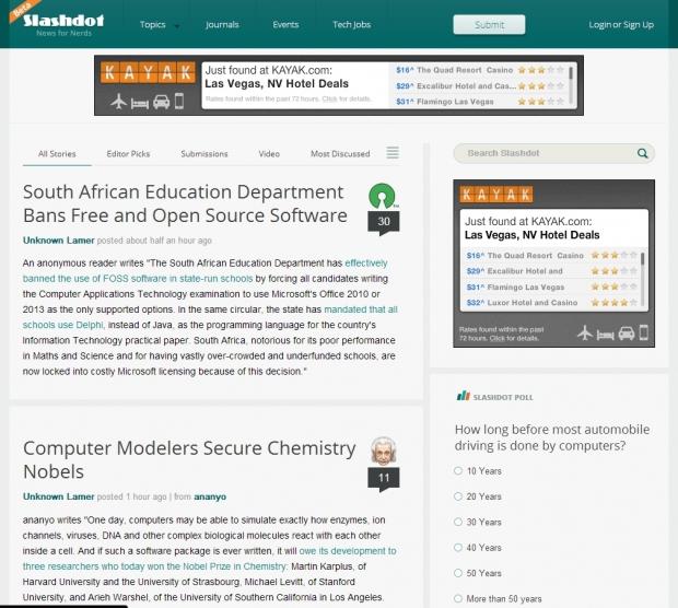
The first thing that really caught my eye is the website's new modern theme. The old sites rounded corners and "Web 2.0" gradients are no more, and the new layout is very appealing to the eye. Lord told me that they really focused hard on simplifying the overall layout, and wanted to make things easy to navigate. The removal of the sites old left-hand navigation bar has greatly cleaned up the overall appearance as well.

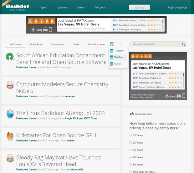
Lord said that while Slashdot has always been more heavily weighted towards text, the new layout allows Slashdot to display a single eye catching image atop some of the frontpage post. While some users prefer an image along with their teaser, so do not, and Slashdot has kept those users in mind. A new widget has been placed at the top of the news feed that allows users to switch between three viewing modes. The Standard View will appear as default and will display a single image along with the content teaser. Additionally users can select Headline and Classic views that will set the site to display just the post headlines or the classic view which displays the full post.

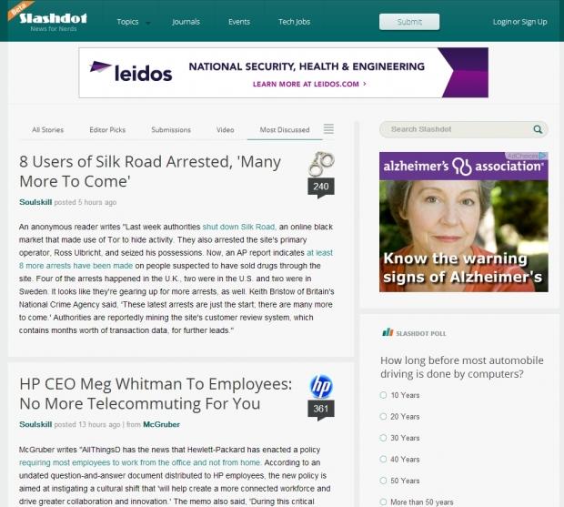
Slashdot has utilized a secondary navigation menu at the top of the post section on the front page. This new menu will switch the feed between All Stories, articles that the Editor chose as favorites, content submitted by the sites users, a new video section and even a most discussed filter. When combined with the main navigation menu at the top of the screen, this new setup allows for quick and easy navigation through the website.

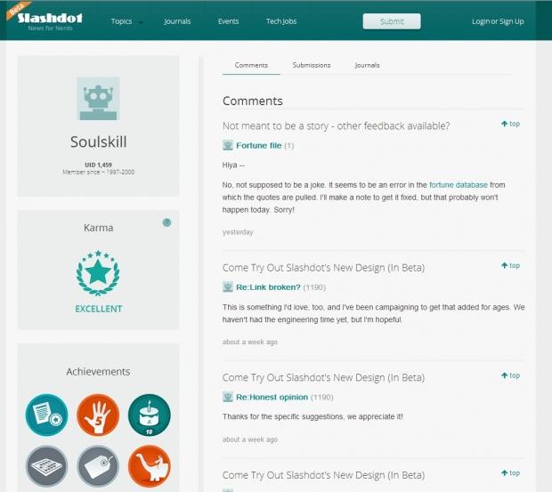
One of the biggest headaches to the old Slashdot was its user profile pages. During my walkthrough Lord explained that the redesigned website brings forth a completely new user profile experience that allows users to have a more feature rich experience at Slashdot. Karma, Achievements, and comments are now neatly organized into a very easy to follow layout and navigating to a users submissions and journals is easier than ever.
Slashdot's redesigned website is available in Beta form for all to see and they want to hear your thoughts on the new site. Leave a comment here or head over to the official launch post on Slashdot to leave a comment there. I would like to thank Tim Lord, and Benjamin Doda for inviting me to take a look at the new site and I hope we can work with them more in the future.


