Introduction

Battlefield is one of those gaming franchises that has seemed to get it right with every single new release, and Battlefield 4 is no exception. Sure, the game has had its fair share of EA launch bugs, but the game is actually one of the best FPS titles ever made. The core game is loads of fun, and I am really digging the attack boats on maps like Paracel Storm and Hainan Resort. The China Rising DLC is fun, but I have yet to really get into any of the maps, and I often find myself defaulting back to the core set.
That brings us to Second Assault, the latest Battlefield 4 DLC for PC. Xbox One players have had access to Second Assault since December, but the low-resolution textures really do not do the game justice. A PC is really needed to show off the beauty that is Second Assault 2014. When I first logged into Battlelog yesterday and loaded up my first round of Metro 2014 I was, for lack of better words, blown away. Frostbite 3 and the new high-resolution textures really give Metro a whole new look and feel while retaining that familiar feel.
With each of the re-released maps containing new elements, Levolution features, and better textures while remaining quite similar to their predecessors, I decided to write up this article and post some side by side comparisons to show our readers just how much better the 2014 edition levels look, as well as showing off how much each has changed in the years since that have passed between Battlefield 3 and Battlefield 4. In the upcoming pages, you will see several screenshots from each game side by side. I tried to position them as close to each other as possible, which was no simple task, by the way.
All images captured for this comparison were taken on my main gaming rig. The PC, while a bit dated, managed to run BF3 and BF4 almost flawlessly at Ultra settings. Specs have been listed below.
PC Specs:
- AMD Phenom II X4 965 BE clocked to 4.1GHz
- GIGABYTE 890FXA-UD5
- 16GB Avixxer RAM
- Sapphire Radeon R9 270X
Battlefield 4 Specs:
- Graphics set to Ultra
- AMD Mantle
- 1080p Resolution
- Average Frame Rate 68
Battlefield 3 Specs:
- Graphics set to Ultra
- DirectX 11
- 1080p Resolution
- Average Frame Rate 103
Caspian Border
Caspian Border Screenshots
The first map we will be taking a look at is Caspian Border, a map that was loved for both aerial and ground assaults in Battlefield 3. I spent dozens of hours honing my helicopter and jet skills on this map, as well as mastering my long-range tank shots. Caspian was number 3 on my favorite Battlefield 3 maps list, and Caspian 2014 looks like it just may rank in the top 5 as well.
Caspian is now overgrown with field grass, and a new 50-foot wall runs down the middle. The original tower lays in ruins on the US side of the map, while a new tower has been constructed on the large hill in the center of the RU side. Other than those two features, much of the map is unchanged, aside from new textures and the fact the season has changed from spring to fall.


The first thing you will notice is that Caspian Border 2014 is set in the fall and overgrown with brown grass. The water is much more realistic now, and the sun is coming in from a different angle.


You might remember that the original tower fell at the end of the round in Battlefield 3. It now lays in ruin with its foundation rusting away. The accompanying building is also now destroyed, and grass covers the old driveway.


Heading over to the border crossing, we see that a lot has changed since the events of Battlefield 3 took place. A new wall has been constructed on the border; gone is the easily penetrable fence. The TOW launcher is still present, as are many of the vehicles, although they seem to have changed company names since BF3.


Heading on top of the building adjacent to the TOW launcher, we can get a scope of the wall, as well as more of the border crossing.


Walking around to the other side of the crossing, we can see that the RU crossing lanes have been removed and all that remains is the ominous wall towering high with dual sentry towers adorning the entry / exit point.


Still on the RU side of the map, I headed to the top of the hill. This was the point of many battles for me in Battlefield 3. I loved laying up here and sniping players as they attempted to summit the hill. Now we can see that a new building tops the hill, and you can partially see the downed tower I accidentally blew up out of curiosity.


Just to the left of the building is the location of my favorite sniper nest. From this point, I killed many enemies who attempted to flank the hill during assaults. This is an excellent image to point out the graphical differences between Battlefield 3 and Battlefield 4. The water and environment look almost photorealistic, and even the haze in the background looks more lifelike.


Heading over to the "gas station" area of the map, we see that the once burning fire has long been extinguished, and the entire area looks weathered and neglected, something you would expect in a post war zone. Some of the vehicles have changed, or are missing, but that seems to be common in this DLC.


Finally, we head to the gas station rooftop to take a look at the scene from another angle. Once again, it is clear that the fire is now out, and that everything is much browner and less blue/green now. All in all, Caspian Border 2014 feels like a refreshing update to one of my all-time favorite FPS maps from the Battlefield franchise.
Firestorm
Firestorm Screenshots
Firestorm is one of those levels that you love and hate at the same time. I hold it as my number 4 favorite Battlefield 3 level but loathe it if I do not have access to a tank, jet, or helicopter. My fondest memories in Battlefield 3 are when my squad of friends posted up on the mountaintop by the US base and spent the entire round with sniper rifles, Javelins, and SoFlam designators basically owning a 64-person round of Conquest Large.
Not much has changed between the original Firestorm and Firestom 2014 other than some new construction, better textures, and a much more hazy/smoke filled atmosphere.


Starting off on the RU side, the first thing I noticed was how realistic the small building to the left of the tanks was. As you can tell, the fire is still burning far off in the background, and the entire level is much darker than before. I don't know if the darkness was a contributing factor or not, but this level looked far more realistic than any other Battlefield 4 map I have played. Metal actually looked like metal, and the grass looked more convincing too.


A shot of the ground and grass that went a long way in convincing me that I really was in a photorealistic environment.


Here you can see the large oil tanks. In Battlefield 3, they were largely intact and provided awesome sniper nests, but now some have been destroyed with a large fire blazing in the background.


Moving on to the refinery area, we can see that the old building has been replaced by a new taller structure that has been damaged from the fighting that has taken place since Battlefield 3. The cars have changed a little as well, and the tanker truck seems to have been flipped over at some point.


Not much has changed with the refinery. With the sun coming in at a new angle, the entire structure appears to be darker, but, upon closer inspection, you will see that the colors are more vibrant and the textures are more realistic.


Fire in Battlefield 4 is more realistic than anything else I have seen in other games. Frostbite 3 does a very good job at rendering realistic flames and explosions. This was a cool shot I felt I needed to include to showcase just how graphically intense the game actually is.


Lighting in Battlefield 4 is much more dynamic than Battlefield 3, and here is a perfect example of that. In Battlefield 3, the lighting inside these warehouses was mottled and dark, but everything appears brighter, and much more dynamic in Battlefield 4.


Some argue that high-resolution textures are not a necessity when it comes to FPS gaming, but I counter by saying that realistic textures make the game better as a whole and those who spend thousands on their gaming machines deserve to be able to push those high-end graphics if they chose to do so. Here is an example of just how textured things get. The cracks in that wall have cracks themselves.


These last two images showcase my favorite spot on the map. As I mentioned at the top of this page, I spent many hours perched atop this mountain with my old squad while we dominated the map with Javelins and sniper rifles. Now, the smoke makes it hard to see across the map, and I would guess that sniping is made much more difficult because of this.


Gulf of Oman
Gulf of Oman Screenshots
Gulf of Oman is one of the maps I hardly ever played in Battlefield 3. Its offshore US spawn just never worked out well for me, and as a fly or tank map, I never seemed to do very good.
The map was fun for some large games where I ran around as an engineer and blew up tanks all day, but that gets old after a while. I did enjoy sniping from the large cranes, but that never lasted long as attack helicopters and jets always strafed them first.


I am starting things off with a close look at the attack chopper. While the model is almost exactly the same, I actually prefer the look of the Battlefield 3 version over the Battlefield 4 version. With that said, the deck of the aircraft carrier looks much more realistic than before.


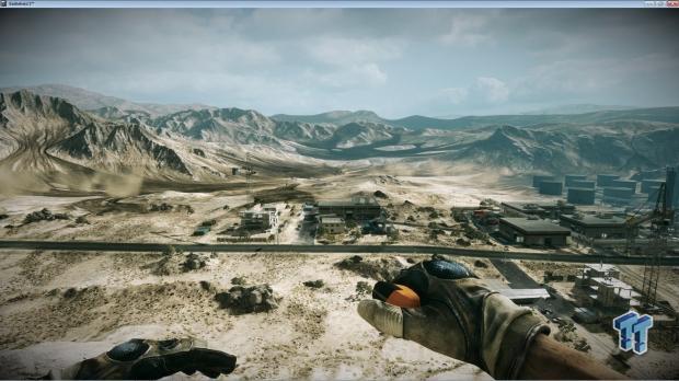
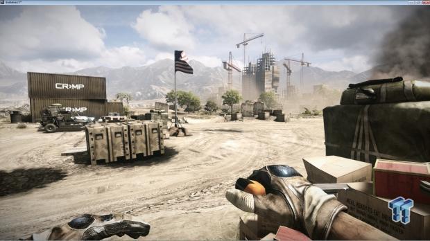
After jumping in the attack chopper and heading to dry land, we come upon the first capture point. You will notice major differences this time around, with there being fewer large ammo crates and many more small boxes. The beach sand looks more realistic now, but you will notice a lot of smoke and sand in the atmosphere, which makes it much harder to see anything long-range. This is a big issue for those who like to snipe from across the map.


Here is another shot showing the improved detail and dense atmosphere that surrounds the map. In Battlefield 3, you could clearly make out the mountains in the distance, but they are indistinguishable from the dust cloud in Battlefield 4.


Looking back in the other direction, you will notice that some construction has resumed on the buildings, and that the cranes are now repositioned. Again, the thick dust-filled air prevents long-range viewing, however, a good sniper could use this to his advantage to stay hidden.


Up close, we can see that the building to the left remains untouched and some elements have been removed or repositioned all together.


Before moving on, let's take a trip up one of the cranes and see how the view from above is. Just climbing the ladder and looking up shows the amount of detail that went into redesigning the textures for Battlefield 4. The structure looks more like a real steel ladder and less cartoonish than before.


Once up top, we can see that the years of being exposed to the elements high-up have taken their toll on the crane, and lots of rust is visible. Up here, you can really see how much of the map is blocked from view by the smoke and dust in the air.


You will also notice that the crane has been repositioned in what I assume is an effort to make it a more enticing perch for snipers and rocket wielding players. The crane is now positioned so that an easier shot can be made to the large building under construction and the smaller buildings surrounding it.


Jumping down to the ground, we land at the base of the largest building on the map. As you can tell, more color has been added to the cloth draped over the sides, and scaffolding now adorns the lower levels. Dice put a lot of time into making all of the Second Assault maps better than before, and each of these new vantage points are a testament to both player feedback and developer intuition as to what players are looking for.


Heading into the smaller buildings along the gridded streets lends us a little info into the events that transpired between Battlefield 3 and Battlefield 4. It appears that some of the town was reconstructed but was damaged again by another fight.


Here you can see that a once-destroyed building has been rebuilt.


Finally, not much has changed at the overpass portion of the map. It appears that the bridge has gotten a new coat of paint, but the maintenance crews chose to not remove the wrecked car and tanker truck below.
Metro
Metro Screenshots
Finally, we come to Metro, everyone's favorite "Meat Grinder" style map where grenades, LVGs, and SMGs rule with an iron fist. Metro was my favorite map in Battlefield 3 and was the first map in which I ever broke 100,000 points in a single round.
I have spent hundreds of hours playing both Conquest and Rush versions of Metro and truly believe that it is one of the defining maps in the Battlefield franchise. Dice's decision to bring it back for Second Assault is one of the best things they could do for Battlefield 4, and the fact that there are already over a hundred servers hosting this map is a testament to how popular it truly is.


Starting off at the US spawn, we can see that the familiar blue glow has been replaced by more realistic warm lighting and that some of the overhead pipes have been removed. You will also instantly notice that the tunnel has been flooded with water, making prone firing positions impossible, which actually makes it much easier to pin the US team than before.


Moving forward, we come across one of the major choke points in the original Metro: a locker room near capture point C. This is another one of those moments where you can really see the difference that the new lighting and texture effects make.


Yet another WOW moment comes when you see how more realistic the subway trains are with the new textures and lighting effects. I spent over an hour just walking through the entire map checking out each key object and how it has changed from the original to the newly updated version.


I guess at some point some poor soul was forced to trek into the destroyed subway and change out the advertisements.


One of the major changes to Metro is that the elevators at point B are now fully functioning from the bottom up. This helps to prevent the old choke points that Metro was so famous for.


Stepping out to the other side, we can see that the new lighting really does give the map an entirely new feel, while still remaining familiar. Notice that the tracks are flooded all the way up, as well.


The once open tunnels have now been filled with wrecked subway trains, which should help prevent camping snipers from aiding in any form of domination on the lower level. There are a few hiding points still left that I was able to use to my advantage, though, so not all hope is lost.


Moving back over to the other side, we see another one of the big changes to Metro 2014. There is now an open door on the left hand side. This door allows access up to the top level and is designed to prevent the major bottle neck that developed around the stairs and escalators. I did find it quite easy to camp the top entrance as well as the lower, though, so bottlenecking could still be an issue with a skilled team.


Heading up the escalators, we see that some of the upper elevator area has changed a little with a steam plume blocking the view of the stairwell to the right.


Heading over to the stairs, we notice a large pile of rubble that is the result of a ceiling collapse. This provides cover for those trying to ascend the stairs that were usually instantly killed by snipers lying prone on the other side of the map.


Down in the stairwell, you will notice a Levolution feature in the new Metro 2014. At the beginning of the round, a piece of lumber props up the ceiling and prevents collapse. If the stairwell fills with enemies, a well placed grenade or RPG will send the ceiling to the ground and kill all who are under it.


Back up top, a quick scan of the ticket booth area reveals a few changes and a much less hazy environment.


Here we can see the entrance that leads to the lower level via the door I showed you earlier. This door is easily hit with LVG rounds fired from across the room.


Another choke point for the original Metro now has a steam plume reducing visibility, and not pictured is another entrance / exit farther back that allows this position to be flanked easily.


Inside the ticket booth, we see that power has been restored and that things are much cleaner now. I found it harder than before to infiltrate this position when filled with enemies.


Over by the locker rooms, you can see that another ceiling collapse has occurred, providing a small amount of cover for prone players.


Inside the locker room, the updated lighting and graphics are really showcased. Additionally, some of the power boxes have been replaced by the round cylindrical objects previously found outside of the building.


Out in front of the subway station, we find the favorite camping spot of snipers everywhere. This bus has not moved since the events of Battlefield 3 transpired, but the updated textures and new sun position really light it up.


Walking outside of the automatic doors leading into the left of the ticket booth area, you can really see the difference in dynamic lighting between Frostbite 2 and Frostbite 3. As I have said many times in this article, the lighting and textures really breathe new life into these maps.


Finally, we get our first look at the RU base. The building appears to have suffered major damage and was under repair before the Second Assault. The sky is much more ominous now with thick black clouds looming in patches in the sky.


The building above the "Cafe" capture point still suffers from damage the same way it did in Battlefield 3, providing a nice hiding spot for snipers and anyone else looking to covertly capture the flag.


Closer inspection of the RU spawn reveals the extent of damage it suffered during the Battlefield 3 campaign and shows off the bright blue tarp covering most of the building.


Inside, you will find that the open atrium is now destroyed and nothing but ruins are left. This damage has removed dozens of camping locations and forces players to head out into the map and actually play at a closer range.


Another interior shot of the RU base.


Looking to the left of the RU base, we can see that most of the trees are now gone, and a clear view of what was Sine Crossing is now visible.


Here is the set of cylindrical objects I mentioned earlier that are now found inside the locker rooms near capture point B. They were previously located outside of the automatic doors to the left of the ticket booth. They received a major texture overhaul and really showcase how beautiful Battlefield 4 is.


While these images are of different objects, I really wanted to show you how much more realistic the fire looks in Battlefield 4 verses Battlefield 3. The fire has depth, better shading, and a more vibrant color pallet than before.
Final Thoughts

Well, that's my comparison guide between Battlefield 3 and the newly released Battlefield 4 Second Assault maps.
I have only been able to play a few rounds on each map so far, but it looks like Dice did an excellent job at redesigning the 2014 edition levels into a much more enjoyable experience, while staying true to the map's original design.
I am going to end this article here as a friend just reminded me that writing articles about Battlefield equates to negative kills in Battlefield.
I hope you enjoyed this overview, and I want to remind you to stay tuned to TweakTown for all of your Battlefield news.
