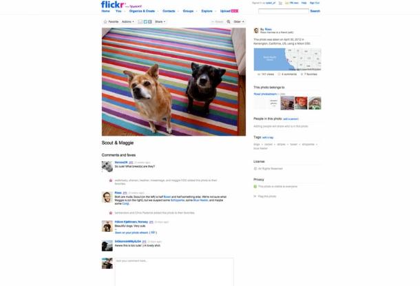
The photo sharing site Flickr is set to improve a major feature. Flickr is moving to something they are calling a "liquid layout" which will change the layout to match the size of the browser window viewing the site. The layout will focus on showing high-res images as large as it can on the main photo pages along with the usual information around the side.

The image above is what it used to look like. The image below is what the new "liquid layout" will look like for someone with a large monitor. The pictures were originally 500px wide as the site launched when 800x600 was the norm. In 2010, this was increase to 640px. Now they have selected a range of sizes so that images won't have to be upsampled.
[img]2[/img]This redesign is just one of many that the aging site is in need of. The site promises many more over the coming year. Next is speed: "Now that the algorithm is complete, we need to work on the performance," said Flickr developer Ross Harmes in a Flickr code blog post. "The first time you go to a liquid photo page, we have no choice but to adjust the page width on the fly. But every other photo page you visit will have the dimensions stored from the last page, and the page will be rendered with the correct width from the start."

