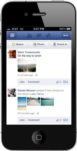
I'm pretty sure Mark Zuckerberg is even more OCD about GUI layout and usage than even Steve Jobs was. The latest example of this is the new update that has been released for mobile users. The update aims to make better use of the limited screen real estate that is often a restriction on mobile design.

Facebook plans to make better use of the real estate by reducing the amount of white space, or blank space. Instead, some of the content will be more densely packed so that more fits onto the screen. Above is a before picture and below is an after. You can clearly see the change in the size of the 4 photos posted.
[img]2[/img]Starting today, we're rolling out an improved design for posts in news feed on your mobile phone. Now photos are up to 3x larger, and all posts will fill your mobile screen from edge to edge. The new design will be available on iOS, Android and m.facebook.com. Check out some before/after screenshots below.[above]
It is likely that if you go to use Facebook Mobile you will immediately see the change. Whether or not you like it, however, is another story. Part of the problem is that there are too many features to pack into a mobile experience. However, it seems as though what Facebook can fix, they will.
